Remagg
Bringing a new gamer backpack to life

TASK:
Bring to life an entirely new product line of gamer backpacks from Samsonite. Raise awareness around the product line and explain the three tiers of products—with pizzazz, of course!
SCOPE:
Landing Page
MY ROLE:
UI/UX
Animation
CLIENT:
Samsonite
Expanding the Branding
Samsonite had already created the sub-brand Remagg (it's "gamer" backwards, with an extra g) and developed the look and feel of several design elements (Remagg logo, icons, and texture). However, these brand assets needed to be expanded to include additional styles in order to feel natural on a web page.

Client-provided assets for the Remagg brand

Final UI elements we created, extrapolated from the client-provided brand assets
I collaborated with Art Director Andy Long to arrive at the graphic treatment, and with our developers who brainstormed animations to match. We knew we wanted to introduce an "X-ray" mode as well as a glitch effect. These types of effects combined with creative interaction design would make the landing page feel like a videogame's opening screens.
From there, I continued the visual style into the UI—selecting a font that matched the gamer aesthetic, creating custom interactive elements, additional icon work to fill out the client-provided set, and gradient lighting effects and geometric crops for the texture found on the inside of the bags.
An easter egg for gamers
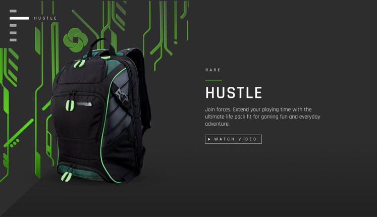
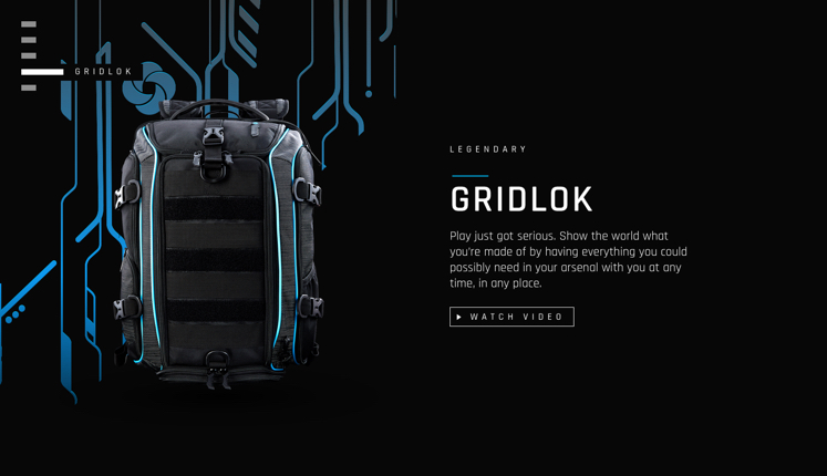
In a nod to video game convention, we ranked the three product tiers as many video games rank gear—Rare, Epic, and Legendary.

Page interactions & animation
A key feature of this page concept was its scrolling and interaction paradigm, which means we got to have a lot of fun with micro-interactions and page transitions. Scrolling exposes additional layers of each bag as you discover more about it. This came together in Principle and lots of TLC in creative QA.
©LAURA MATERNA 2025